Arthur AESCHBACHER
Born in Geneva (Switzerland), in 1923
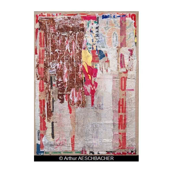
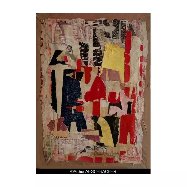
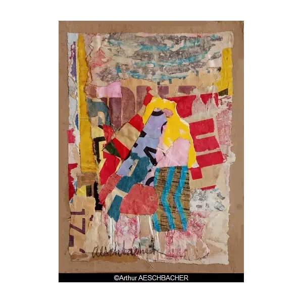
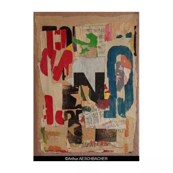
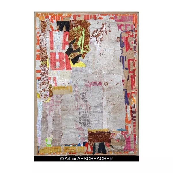
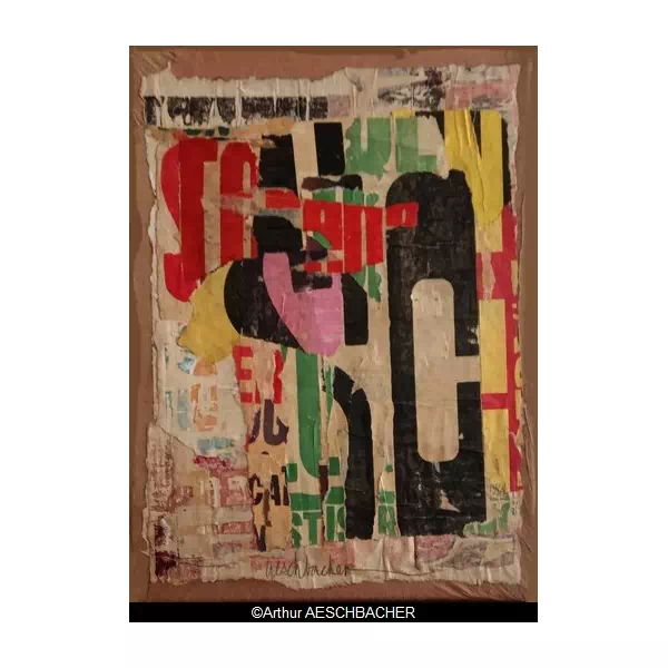
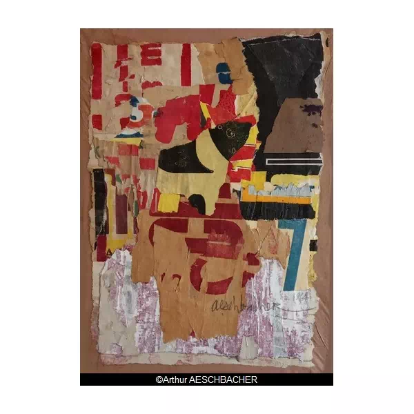
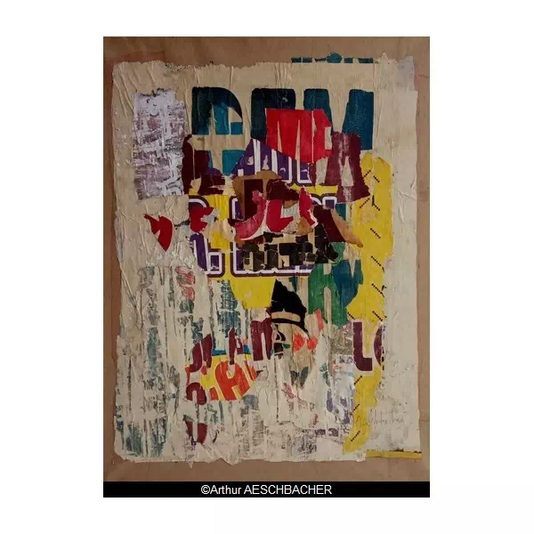
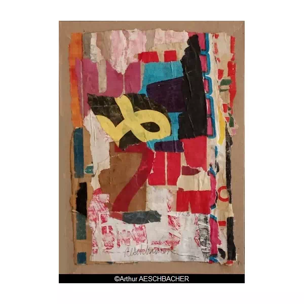
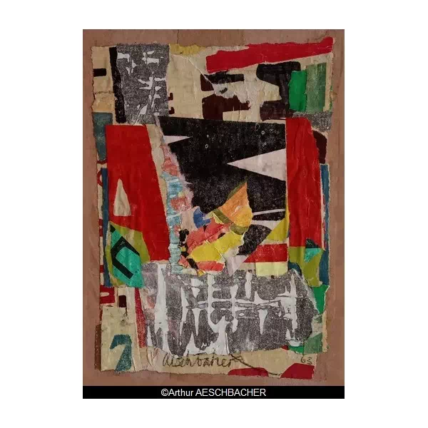
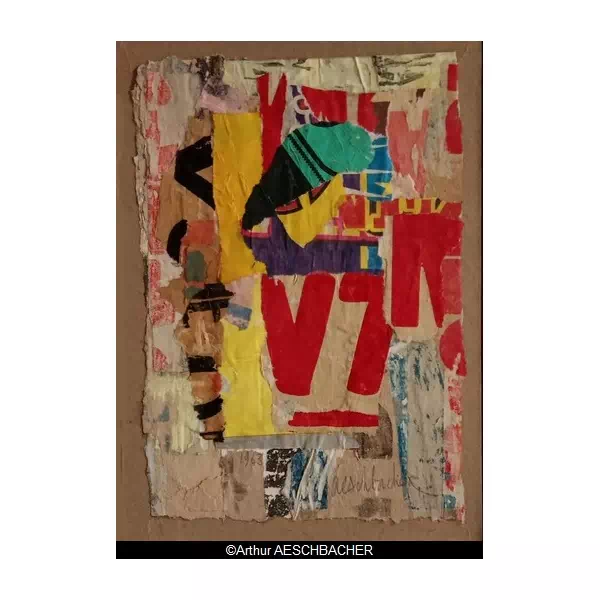
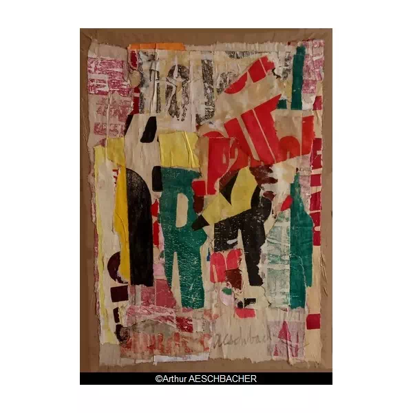
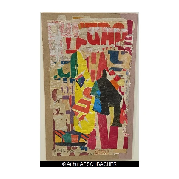
Attached to the poster artists, like Raymond Hains or Jacques Villeglé, Arthur AESCHBACHER uses the poster as a painter’s material. “A poster designer who is not a new realist” confirmed Pierre Restany. Colors, thickness, recesses his paintings are as well, paintings where the poetry of color and letters is central. His works have been presented in many museums in France and abroad.

ARTWORKS
EXHIBITIONS & ART FAIRS


BIOGRAPHY
Geneva School of Fine Arts / Atelier de la Grande Chaumière / Académie Julian / Atelier Fernand Léger
MUSEUM EXHIBITIONS
2015 : Musée de Tessé, « Bleu – Jaune – Rouge, La couleur Libérée », Le Mans, France
2013 : Musée d’Art Moderne et d’Art Contemporain de Nice, « Bonjour, Monsieur Matisse ! Rencontre(s) », Nice, France
2010 : Musée des Beaux-Arts de Brest, « Michel Butor et les artistes », Brest, France
2009 : Villa Tamaris, Centre d’Art, « Le noir et les leçons des Ténèbres », La-Seyne-sur-Mer, France
2007 : Museo José Luis Cuevas, « Lecciones de Tinieblas », Mexico, Mexico
2004 : Fondation Christian et Yvonne Zervos, La Goulotte, Vézelay, France
2001 : Musée d’Art Moderne, « De la couleur … » Troyes, France
1994 : Musée de la Poste, « Plis d’Excellence », Paris, France
1992 : Centre d’art contemporain de Corbeil-Essonnes, « Arthur Aeschbacher », Corbeil-Essonnes, France
1991 : Musée d’Art Moderne, « Collages », Villeneuve-d’Ascq, France
1989 : Centre Georges Pompidou, « Lisible – Illisible », Paris, France
1985 : Centre Georges Pompidou, « Lisible – Illisible », Paris, France
1984 : Fondation Nationale des Arts Graphiques et Plastiques, « L’Art à Paris 1945 – 1966 », Paris, France ;
Villa Arson, « Ecriture dans la peinture », Nice, France
1980 : Fondation Nationale des arts graphiques, « Ecriture 80 », Paris, France
1977 : Musée d’Art Moderne, « Boîtes », Paris, France ;
Centre Georges Pompidou, « Les Avatars de Miss Liberty », Paris, France
1976: Centre of Art and Communication, Vaduz (Lichtenstein)
1972 : Grand Palais, « 31 artistes Suisses », Paris, France
1966 : Musée Galliera, « L’Âge du Jazz », Paris, France
1964 : Musée du Louvre, « 50 ans de Collages », Paris, France ;
Musée de Saint-Etienne, « 50 ans de Collages », Saint-Etienne, France
1963: Grand Palais, « Art contemporain 1963 », Paris, France
SOLO EXHIBITIONS
Belgium : Bruxelles (Jacques Damase Gallery)
France : Avallon (Les Abattoirs d’Avallon) ; Besançon (Galerie Zéro, l’infini) ; Nantes (Galerie Convergence) ; Paris (Galerie Véronique Smagghe, Galerie Incognito Art-Club, Artheme Galerie, Galerie Patrick Corriton, Galerie Marion Meyer, Galerie Anne Lacombe, Galerie Olivier Nouvellet, Galerie Krief, Galerie 30, Galerie Vivian Véteau, Galerie Germain, Galerie Fabien Boulakia, Galerie de Varenne-Jacques Damase, Galerie Paul Facchetti, Galerie Marcelle Dupuis, Galerie La Roue, Galerie Collette Allendy, Galerie Marforen, Galerie de L’Etoile scellée) ; Thonon-les-Bains (Galerie Art-Espace)
Germany : Stuttgart (Galerie Klaus Braun)
Mexico : Guadalajara (Galerie Azul de Felipe Covarrubia) ; Puerto Vallarta (Caracol Arte-Estudio)
Switzerland : Genève (Galerie Sonia Zannettacci)
United-Kingdom : Londres (New Vision Center Gallery)
United-States : Houston (Americas Galerie)
GROUP EXHIBITIONS
China : Pékin (Galerie Art-Espace)
France : Agde (Espace Molière) ; Arras (Centre Noriot) ; Besançon (Galerie Jean Greset) ; Chambéry ; Lacommande (La Commanderie de la Commande) ; Le Mans (Médiathèque Louis Aragon) ; Lille (Palais Rameau) ; Orléans (Collégiale St Pierre) ; Paris (Ambassade de Suisse, Galerie Véronique Smagghe, Galerie Caroline Corre, Galerie La Pochade, Galerie Thorigny, Espace Exhibition, Métro Aubert, Galerie de Varenne-Jacques Damase, Galerie Paul Facchetti, Galerie Florence Garnier, Galerie Colette Allendy, Iris Clert Gallery) ; Pontivy (Château des Rohan) ; Rennes (Maison de la Culture) ; Saint-Cirq-Lapopie (Madi international) ; Tanlay (Centre d’art de l’Yonne, Château de Tanlay) ; Thonon-les-Bains (Chapelle de la Visitation) ; Villeneuve d’Ascq (Galerie Une poussière dans l’œil)
Germany : Mainz (Institut français)
Japan : Senji (Galerie Seijo)
Mexico : Guadalajara (Galerie Azul de Felipe Covarrubia)
Spain : Barcelone (Galerie Ciento, E.P.G)
Sweden : Stockholm (Franska Instituet) ; Malmö (Malmö Konstall)
Switzerland : Genève (Galerie Sonia Zannettacci, Galerie Kurgier), Lausanne (Galerie Kasper)
United-Kingdom : Londres (Brook Sreet Gallery)
ART FAIRS
France : Art Paris Art Fair, Paris ; FIAC, Paris ; Salon Comparaison, Paris ; 31 artistes Suisses, Grand Palais, Paris ; Salon de Mai, Paris ; Art Contemporain, Grand Palais, Paris
Serbia : Triennale des Arts Plastiques, Belgrade
PUBLIC COLLECTIONS (selection)
Belgium : Musée des Arts Contemporains, Hornu, Hainaut
France : Lille Métropole Musée d’art moderne, d’art contemporain et d’art brut, Villeneuve d’Ascq ; Musée d’art moderne de Saint Etienne, Saint Etienne ; Musée Cantini, Marseille ; Musée d’Art Contemporain, Marseille
Switzerland : Fonds d’art contemporain de la ville de Genève (FMAC), Geneva
United-States : Museum of Geometric and MADI Art, Dallas
BIBLIOGRAPHY
2014 : G-G Lemaire, « Arthur Aeschbacher : Empreintes », Galerie Arthème, Paris
2006 : G-G Lemaire, A. Aeschbacher, « Arthur Aeschbacher, rétrospective », Les Abattoirs, Conseil général de l’Yonne, Auxerre
2005 : A. Aeschbacher, « Arthur Aeschbacher, Galerie Marion Meyer », catalogue d’exposition Galerie Marion Meyer, Paris
1997 : M. Butor, A. Aeschbacher, « Le moulin du sang », Zéro, L’Infini, Besançon
1991 : M. Butor, C. Minière, « Arthur Aeschbacher », Centre d’Art Contemporain, Corbeil-Essonnes
1984 : A. Borer, P. Soupault, A. Aeschbacher, « Un sieur Rimbaud se disant négociant », Lachenal et Ritter, Paris ;
« Je te dirai que la Peinture est chose mentale », in catalogue « Ecritures dans la Peinture », Villa Arson, CNAC, Nice, avril
1976 : M. Benhamou, A. Aeschbacher, « Poèmes lus en courant », Ed. Ixia, France
1975 : A. Jouffroy, « 15 ans de Collages Eclatés », Rétrospective Aeschbacher, ed. Jacques Damase Gallery, Bruxelles
1961 : A. Aeschbacher, C. Estienne, « Arthur Aeschbacher », catalogue exposition Galerie Marcelle Dupuis, Paris ;
Michel Butor, « La peau des rues d’Arthur Aeschbacher », éd. SMI,Paris
Articles about Arthur Aeschbacher : Schéma et schématisation n°54 (2001), Opus n°112 (1989), Magenta-Revue N° 18(1988), l’Hebdo-Revue N° 41 (1985), Art Forum International (1983), Opus N° 88(1983), Art Press n°60 (1982), Opus N° 81 (1980), XX° Siècle n°45 (1975), Opus N° 48 (1974), Créé n°14 (1972), Mardi-Samedi n°2 (1965), Métro n°2 (1961), Jardin des arts n°76 (1961), Grammes n°5 (1960)
PRESS

WRITINGS
THE SKIN OF THE STREETS
for Arthur AESCHBACHER
Around the bend in the fence, a poster bursts into flames; through the tear, the phoenix-letter rises from its ashes and the glue on the crumbling walls.
All these papers are feathers for Daedalus, who patiently crafts wings from them for his younger sons, who will one day take flight—that is the promise—and who will know how to avoid the Sun’s traps. We must start the old legends anew. Then they will escape the tangled web of pipes through which rubbish and gases flow, the jumble of wires transmitting false lights and fraudulent conversations, the underground passages teeming with rats and exhausted workers returning home to find their wrinkled wives, whining children, adulterated wine, and mindless programmes on the screens.
The scalpel-sharp eye peels away the layers of the flaky space on the neglected walls. We slip through these cracks, like an Australian mimi through its cliffs, back to the time of the Dream with its organ-like sounds and leaps. This disused factory is Fingal’s Cave, the mosque of Omar or Ibn Tulun. This wasteland, ravaged by bulldozers, offers us, amidst its mounds, the archaeological remains of the last twenty years—even more overlooked than the prestigious millennia. A modest Christopher Columbus disembarking from a creaking Santa Maria of sheet metal and plastic, I part the seaweed to extract idols and inscriptions.
Ladders stand amidst scaffolding and rubble, fluttering in the wind like banners at demonstrations, allowing us to climb up to the cloud-bridges and follow, like guardian angels in ragged robes streaked with drips and splashes, the escapades of young adventurers in search of the Mountains of the Moon and the sources of the Nile, stopping off in Cyprus, Aden, Harrar and Warambot, after their escapades in the Ardennes, Paris, Brussels, London, Stuttgart and as far as Java, in the season of illuminations and ill will, from cities to other cities, new cities, new texts, new letters, the alchemy of coincidence between city and desert, sphere and pyramid, science and silence, depth and surface, farewells and returns.
The curtains of the urban theatre rise all around the researcher, and yet more curtains, right up to the night sky, right up to the eternal chains. A great plaster cast of folly is torn away to the sound of applause, gunpowder trails and flocks of birds.
By Michel BUTOR (translated from French)
–
PAPER, SCRAPS, GLUE…
Arthur Aeschbacher is an artist whose work is linked to that of the poster artists of the 1960s. His approach differs from theirs, however, as his aim is not to tear down posters and elevate them to the status of artworks; instead, he uses the poster as a medium.
His works are composed of collages of paper, torn at random or cut into precise shapes. Arranged in squares or in several concentric circles, the cut-out and glued-on layers of paper play on the textural effects they create. The varying thicknesses of the paper highlight its materiality, itself a mixture of pulp, compressed, smoothed and cut.
The selected fragments are sometimes very neutral, the colour of paper. Others, more colourful and figurative, are like nods to their original function. The visible screen-printing halftones evoke the world of printing. Though immense, they prevent any recognition. The halftone is used here for its graphic power, just as the colours of the chosen papers strip the works of their brilliance.
In a series of recent works, one recognises parts of letters in the cut-outs, forming a sort of alphabet, a coded text. In black or ink blue, the characters conceal their meaning behind a greater focus on the graphic and contrasting emotion evoked by the history of these letters.
Although abstract at first glance, Arthur Aeschbacher’s compositions sometimes conceal anthropomorphic elements—an eye, a mouth—which, whilst not overt, introduce a touch of humour, a festive mood, and the atmosphere of 1960s advertisements.
By Frédérique FOULL (translated from French)
–
THE BODY AND SOUL OF THE LETTER
When I first met Arthur Aeschbacher (it was in the mid-1970s), I remember climbing a considerable number of steps to reach his small flat under the eaves on Rue du Faubourg Saint-Bernard. On the wall hung one of Marcel Duchamp’s later works (a print, perhaps even a silkscreen) in which a large cigar could be seen smoking between the old artist’s fingers and forming a pretty circle. He had met him and had taken from this great prankster the lesson of Dadaism rather than that of a calculating, conceptual art that people thought they had to detect in him. One evening, he invited me to dinner and I was surprised to find Meret Oppenheim already settled on a cushion. She was a curious woman, with very short hair (I had in mind the photograph Man Ray had taken of her), a whimsical face, a loud voice, particularly determined with her outspokenness and her biting humour, whimsical and funny at the same time. In Aeschbacher’s personal pantheon, she held a place just as important as Camille Bryen, who seems to have been his guide in Paris (Arthur is Swiss, let us not forget). Meret Oppenheim had captivated him with her beauty and her character, but also with her objects of symbolic significance, such as the famous hairy cup. To sum up the impression I had of him at the time, I might put it this way: a good third of Dada, a dash of Surrealism, a pinch of Lettrism gleaned from the capital’s bistros, and a hint of nonchalant dandyism and pithy one-liners, plus a third of inventiveness constantly at odds with the fashions of the time.
But make no mistake: he doesn’t much like talking about himself—if at all—for he speaks only of an artist who bears his name. Of his father, he really only mentions the collection of paintings and drawings, and of his mother, a circus horse-rider, he recounts only the magical atmosphere that surrounded her and the old-fashioned charm of a caravan filled with dreamlike objects, turning her into a Lola Montès as she appears through Max Ophuls’s camera lens. His family history is not a Freudian drama, but an aesthetic mythology. It serves to provide a few clues for understanding the meaning of his creative approach. Without revealing anything. What is certain is that a touch of nostalgia lies at the heart of his artistic quest, which is not apparent at first glance in his works, but is nonetheless perceptible in the themes he has chosen to guide it. Anything that might be linked to an autobiography is, after all, revealed only through a title or the choice of a particular poster to create a painting, or through the expression of that boundless love for the Morrice columns. If one truly wishes to understand who Arthur Aeschbacher is, it is necessary to bring into the picture another important figure who was part of his small circle and who, in turn, has taken his place in his pantheon: I am referring to Brion Gysin. In Paris, in his room at the modest hotel on Rue Gît-le-Coeur, which was later nicknamed the ‘Beat Hotel’, he had developed various literary techniques based largely on random practices: cut-ups, fold-ins and permutations. For months, he experimented with these revolutionary methods alongside William S. Burroughs, who occupied room 23 in the same hotel. One thing led to another, and Burroughs adopted the cut-up and, to a lesser extent, the fold-in to write a major trilogy of novels – ‘Nova Express’, ‘The Ticket That Exploded’, and ‘The Soft Machine’. For his part, Gysin focused instead on exploring the possibilities offered by permutations to produce groundbreaking sound poems. Aeschbacher adopted none of ‘Lady Sutton Smith’s literary methods’ (as the author of Naked Lunch had christened them). But he was deeply influenced by them. They served to give substance to his intuitions, particularly regarding the role he wished to assign to words and letters in his paintings.
The basic principle is almost always the same: he works by layering posters, more or less torn, which are not ‘found objects’ from the street (this is what sets him radically apart from the New Realists), but are taken from old stocks of theatre, circus or variety show posters, some of which date back to the early 20th century. This decision stems as much from the typographical quality of these posters of all sizes as from their brilliant inking and layout. The poetry strictly linked to the written word that characterises them offers the artist the ability to imagine an authentic visual poetry that almost completely abolishes legibility (rarely is an emblematic word or two used). Thus, the former underpins (and implies) the latter and is immediately integrated into the desired effects.
I shall take as an example this painting entitled Noir caméléon (2000). In this large-scale composition, dominated solely by black and white, featuring torn and more or less superimposed posters, as well as various black geometric shapes, the combination of words, characters and abstract areas creates a space where the letter triumphs by relinquishing its prerogatives. This, however, only makes it all the more evocative. In other words, the pure mechanics of assemblage and collage are inextricably linked to the free exercise of painting – which is reflected in the brush-based rendering of certain printed characters and the construction of the whole according to principles that bring it close to Neoplasticism. For him, the painting is an extrapolation in which the letters are organised according to a rigorous formal concept, yet one that rejects the rules of formalism. Yet this work, however representative it may be of his inner evolution, cannot on its own sum up his artistic ambition. In other works, he may saturate the surface of the canvas with his torn posters, as he does in his Théâtre éclaté, or, conversely, retain only a few fragments of lines and letters, as seen in his Oblitérations from 1990. The canvas may also be divided by narrow horizontal and vertical bands, as, for example, in Sous-sol Bleu agave (1987). In contrast, in Écriture sérielle (1979), he used blue hatching that cascades from top to bottom, whilst a wide white band crosses the surface of the painting vertically through its centre. In this way, his visual universe retains its coherence, yet is constantly undergoing metamorphosis, whilst the fundamental principles of his artistic quest remain largely unchanged.
Throughout his long career, Arthur Aeschbacher never ceases to surprise, despite this admirable theoretical consistency. His works all possess the ability to evoke that poetry which belongs to those silent yet oh-so-eloquent things that painting brings forth when it lives up to its ambitions.
By Gérard-Georges LEMAIRE (translated from French)